
This design is not just a visual symbol; it’s a strategic representation of your brand’s core values and purpose."
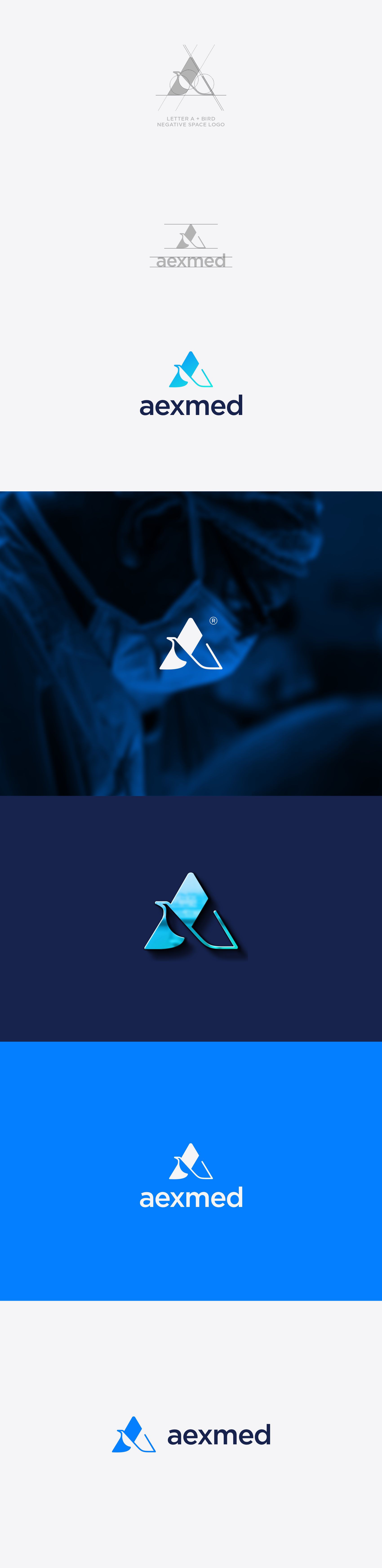
Concept: "The logo merges the letter 'A' with the image of a bird, crafted in a sophisticated negative space style. The letter 'A' is not only the initial of AEXMED but also symbolizes the 'Approachability' and 'Authority' of your platform. The bird, on the other hand, represents 'Freedom' and 'Trust,' crucial elements in the medical and insurance sectors."
Design Rationale: "In the highly sensitive field of medical document transfers and expert assessments, trust and reliability are paramount. The bird in flight conveys freedom
from complexity, while the letter 'A' reinforces your brand's leadership in providing seamless, accessible solutions. The negative space technique used here adds an element of clever simplicity, reflecting the user-friendly and efficient nature of your software."