
Creados en 99designs de Vista
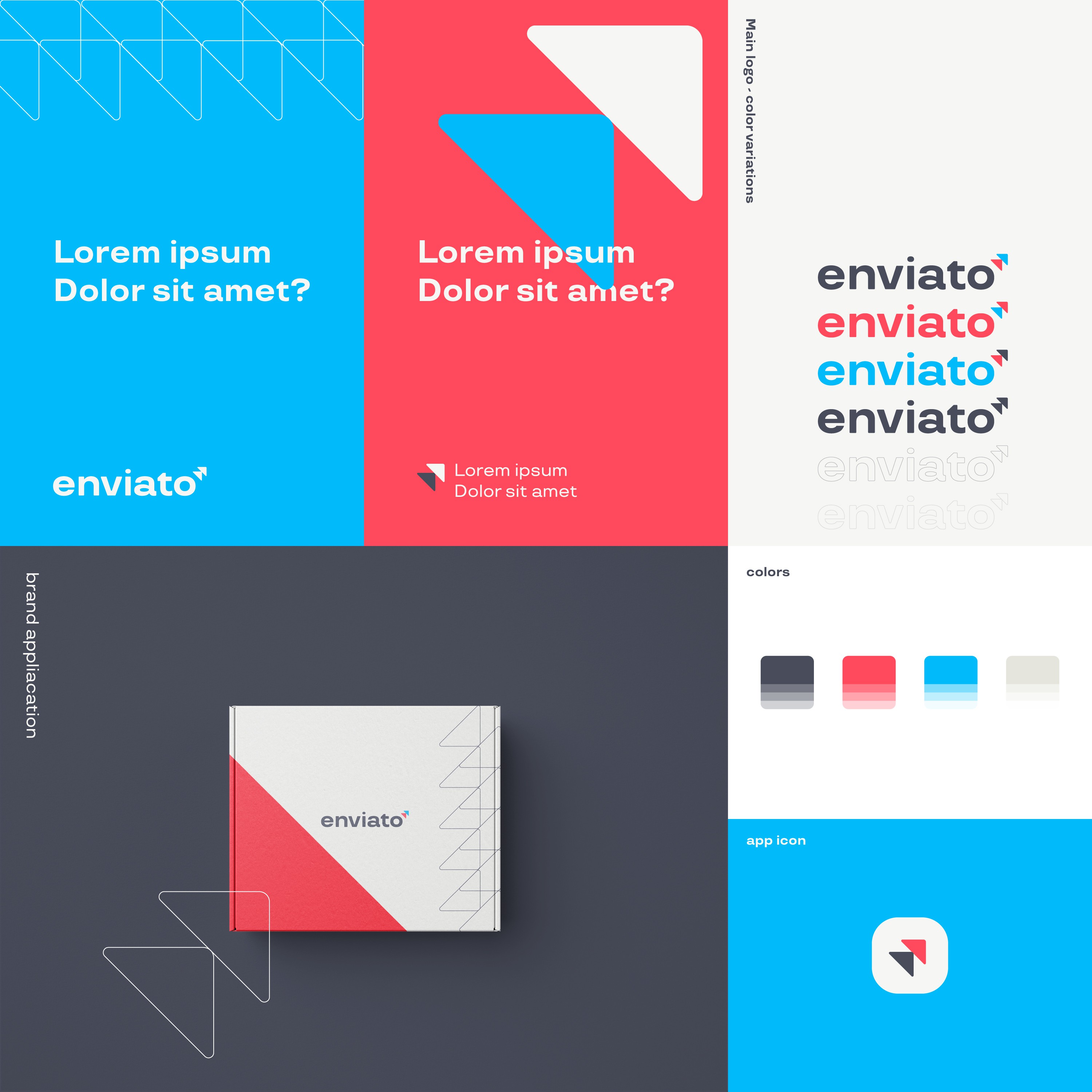
The logo design encapsulates a simple yet meaningful concept. It features two arrows pointing upwards, each symbolizing a key market: one representing Brazil and the other the United States, both central focuses of the company's operations. This symbol is harmoniously combined with a unique typeface that has been meticulously tailored for this brand.
Accentuating the brand identity, a clean and vibrant color palette has been selected. This choice not only communicates stability but also highlights the seamlessness of Enviato's shipping and delivery services. The complementary nature of these colors enhances the brand's readability and ensures its content is easily absorbed and understood by the audience.