The Future of Education Video Series Logo

20
Creados en 99designs de Vista
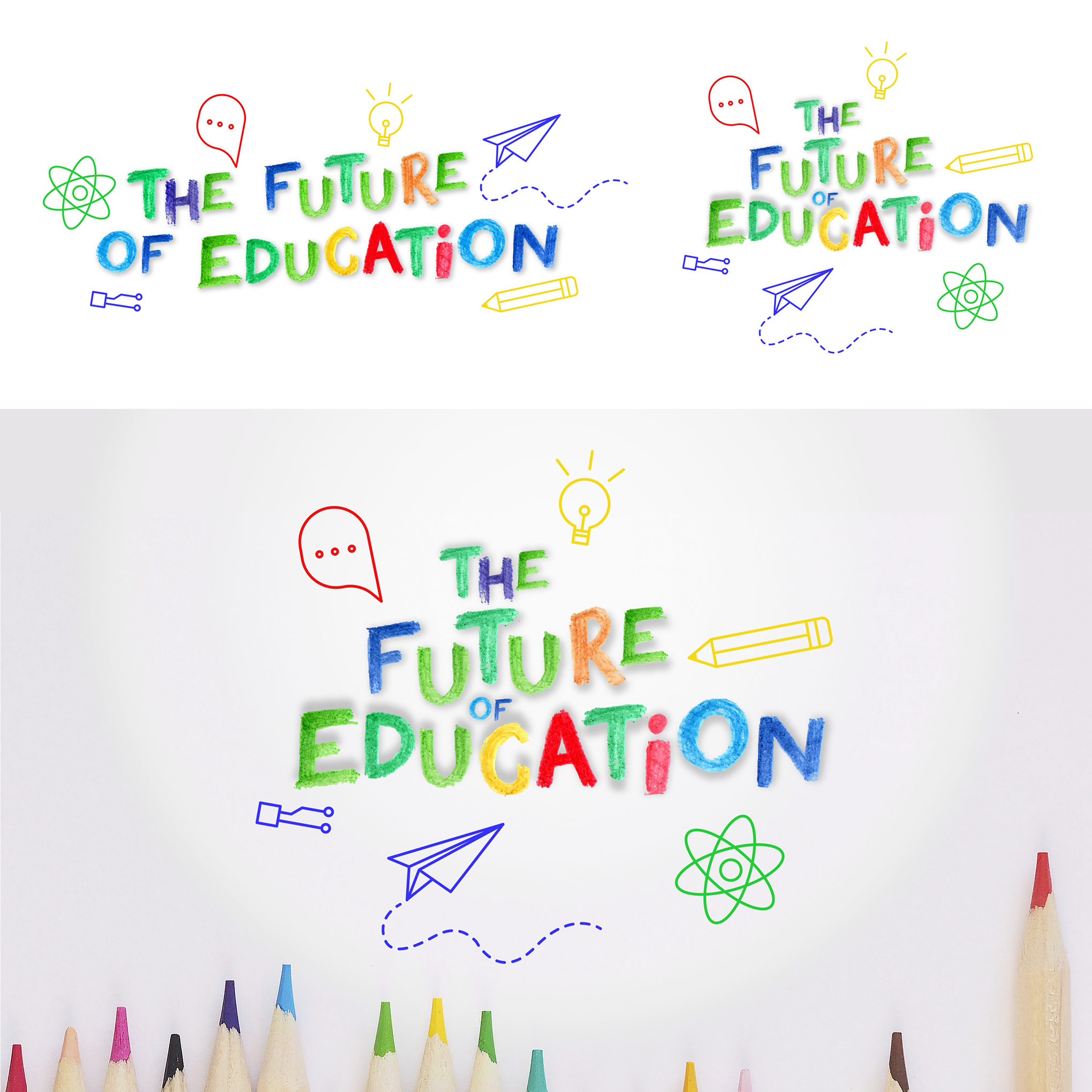
I developed the logo entirely by thinking about the series of videos and animation. To that end, I decided that I would use easily recognizable icons so people could quickly notice what the logo is about. The name of the logo is made entirely by hand and then passed to the computer. The colors of the logo reminds the children, the diversity and fun, as well as the shape of the letters that I tried to do something very fun and relaxed. The icons were not crayons because they need to be clearer and simpler for better and faster recognition, as I mentioned. This was a very fun project to do and I hope you enjoy the result!