No Way! Donuts Logo Design

0
Creados en 99designs de Vista
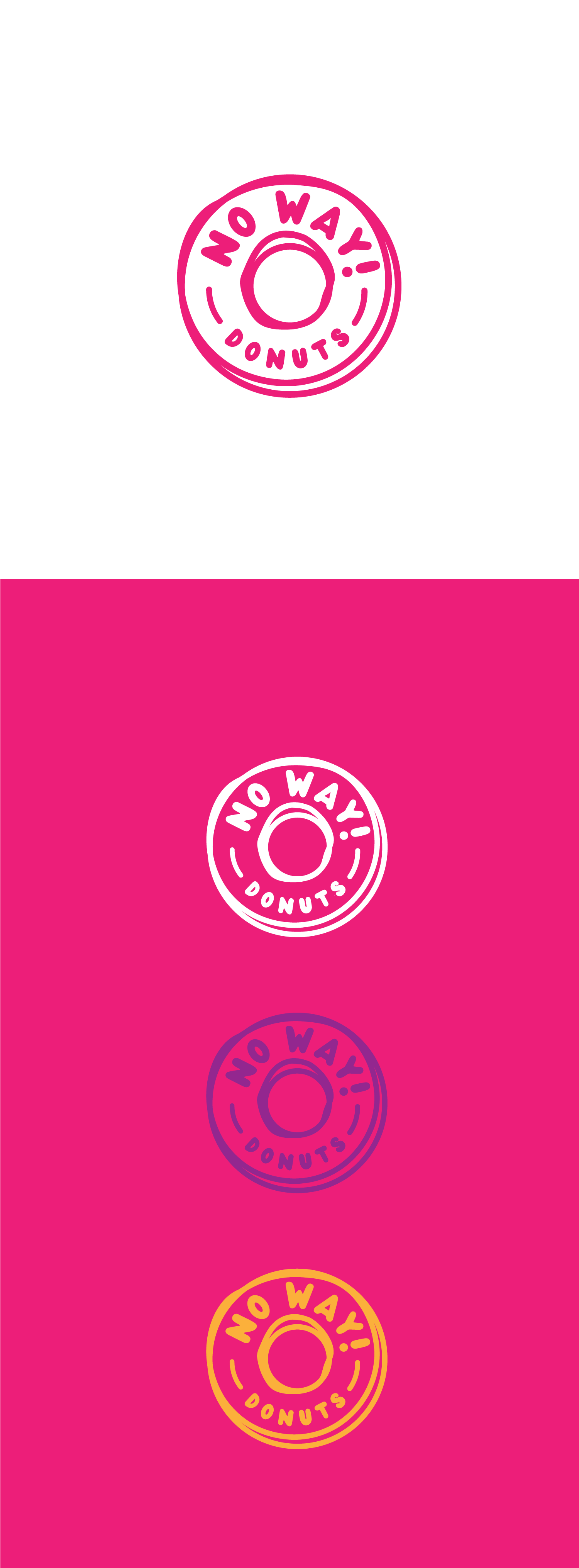
The No Way! The Donuts logo is designed to capture the fun and playful essence of a trendy doughnut shop. Featuring a bold, circular motif that mimics a doughnut, the logo uses a vibrant pink-and-white colour scheme to evoke a sense of sweetness and delight. The whimsical typography adds to the youthful and energetic feel of the brand, making it appealing to a diverse clientele looking for unique and tasty treats. This logo effectively communicates the brand's identity as a delicious, eye-catching doughnuts purveyor.