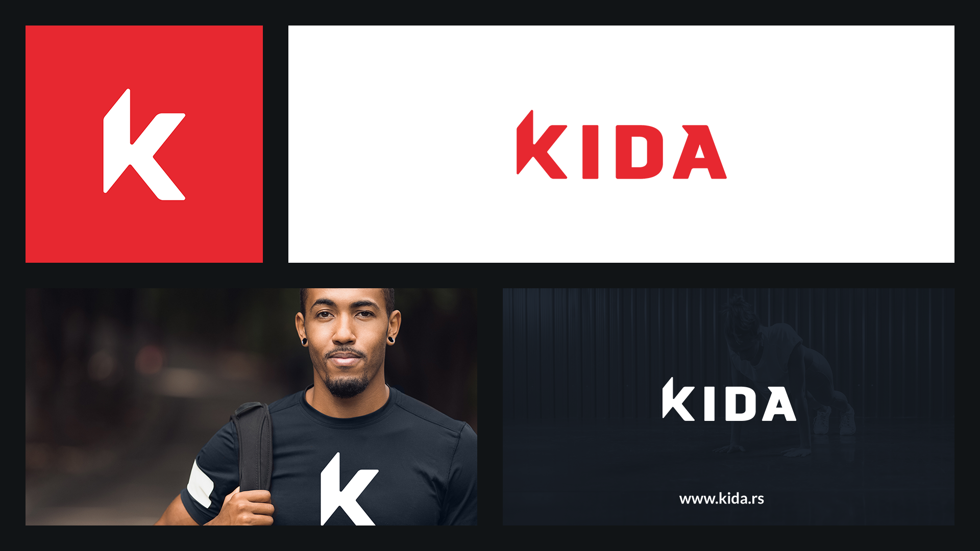

Kida is a fitness app with daily workout videos to help you improve your body.
The app has both workout and stretch daily videos, and is meant for all people, beginner or athlete. Idea was to differentiate the brand from the competitors by creating a bold, powerful wordmark. In order to do so, we created a memorable wordmark with custom-designed typography for the company name.
The challenge for the brand was to reflect the excitement and passion to workout, so we used red color as the primary one, because red is a powerful color that is energizing and suggesting passion and love. It was also important that the logo is responsive, which gives the brand flexibility to connect with the audience in many ways, so the brand can use the first letter K as a standalone symbol.