A4 promotional poster for the personal development program

12
Creados en 99designs de Vista
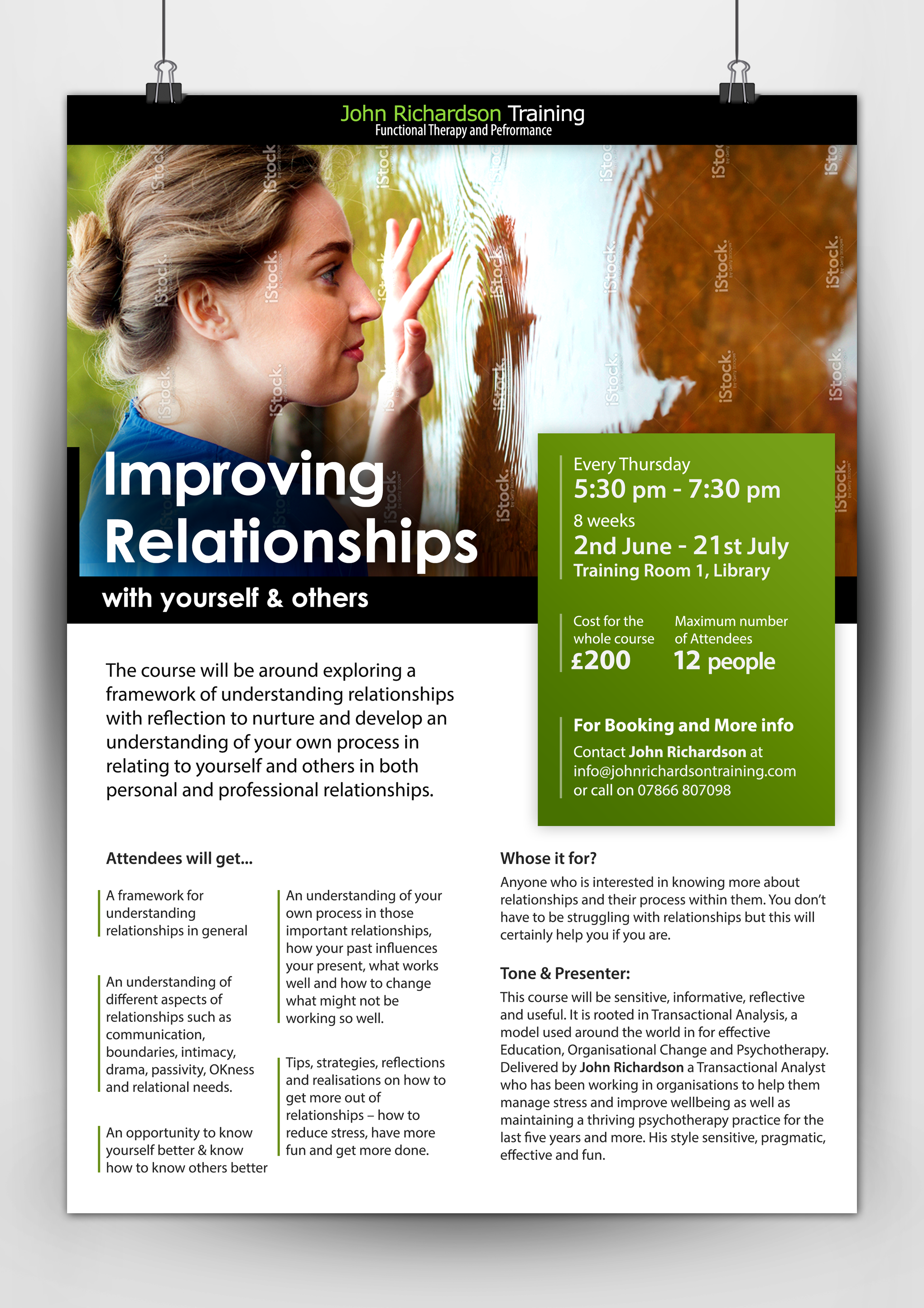
I didn't want to use any cliched image of people having fun with friends and family. I felt this is more about understanding yourself in order to improve relations with others. Hence I chose this image which through its unique angle makes it more interesting.
Also since, the content was more, I have separated the key information (which is to be needed in order to attend the session) separately in a larger text and a contrasting background. The rest of the text is large enough to be read while the printed copy is in notice board or held in hand. (I have checked the standard font sizes in popular magazines). So readability shouldn't be a problem.
And since it is categorically distributed, it wouldn't feel content heavy either.