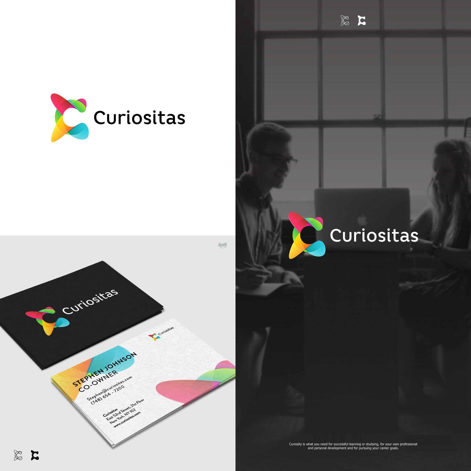
Bright and colorful logo for curiositas

4
Creados en 99designs de Vista
My approach for this concept was by using the stylizing the letter C in an abstract form. As you can see as a whole, the logo makes some kind of moving forward motion which is meant to represent what does the company's audience are trying to do; "moving forward in any educational process" and the color divisions stand for the helps that the company's offers.