Minimal wine label

32
Creados en 99designs de Vista
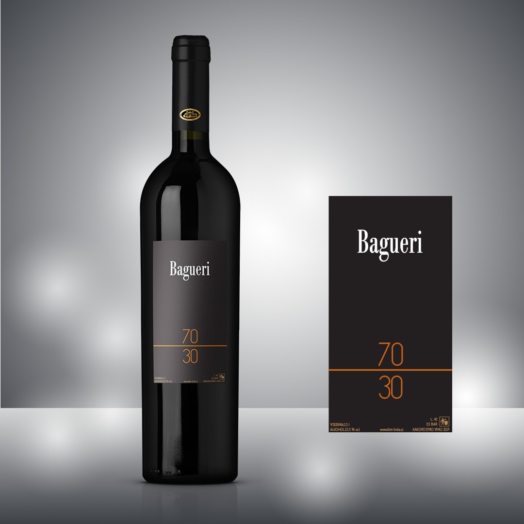
The client requested a label that is really minimal and elegant. The name of this wine is a numerical proportion, so I've decided to use it as main element of the label design. The divider line is placed roughly at 30% from the bottom, and the number are placed like a math fraction.
In the final design, all the text at the bottom was deleted, so the label is more clear.