Información necesaria
Nombre de la empresa
The Gap Inc
Descripción general
** This project is sponsored by 99designs **
Gap recently announced a new logo which has received criticism from designers and customers all over the world. We think the 99designs community of designers can do much, much better!
The winning design will be decided by community vote and 99designs will present the winning logo to the management of The Gap Inc as a gesture of goodwill. The winning designer will also be featured in the next 99designs newsletter!
**ONLY star ratings will be given as feedback during the contest. Designs will be eliminated if they are inappropriate or completely off brief**
1 star: Does not meet the brief or is extremely low quality.
2 stars: Shows some creativity however needs to be refined further.
3 stars: Good design however it could be improved with some further refinement.
4 stars: Design is looking great definitely one of the best.
5 stars: Amazing design, we love it! Great work! :)
** About Gap **
Gap offers iconic American style to customers of all ages.
Since 1969, customers have looked to Gap for updated, casual clothing and accessories that help them express their own personal sense of style. Today, Gap continues to be the best destination for wardrobe essentials such as T-shirts, hoodies, great-fitting pants and denim. What began as one brand has grown to include Gap, GapKids, babyGap, GapMaternity and gapbody.
Gap has become a cultural icon by offering clothing and accessories rooted in cool, confident and casual style to customers around the world. The company has over 3400 gap stores worldwide and is a publicly traded and well respected business globally.
Descripción de la organización y el público al que apunta
When Gap was founded in 1969, its targeted customers were the younger generation. Hip young customers who appreciated the high quality jeans they produced. As the business idea became successful, Gap expanded its offerings and now targets men, women and children with its wide range of products. See: http://www.gap.com
More about gap's long history can be found by viewing the wikipedia page: http://en.wikipedia.org/wiki/Gap_(c…_retailer)
Detalles del contenido
Requisitos
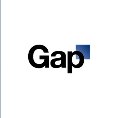
The goal of this project is to design a far more suitable and recognizable logo based on the target market and the companies iconic products. The recently released logo (newlogo.jpg) is extremely bland and has had a horrible backlash from the worlds design community. We feel that our design community can produce a far better logo!
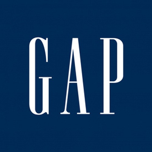
You are free to use your imagination when designing this logo. The only requirement is that your design reflect some aspect of the brands history or target market. A copy of the companies iconic original logo is also included (oldlogo.jpg) - Feel free to use this as inspiration.
Every logo submitted should be:
1. Legible, easy to decipher the letters and the name of the company. Flipped or mirrored lettering goes against this.
2. Effective without color, looks good in black & white
3. Scalable. Works at 1 inch and 100 feet.
4. Versatile & multi-purpose. Has to reproduce well on business cards, pens, letterhead, mugs, tradeshow booths, etc.
5. Simple & memorable. Don't get too complicated.
Come on designers - let’s show them how it’s done!
Note: This is NOT an official Gap promotion and is in no way affiliated with or endorsed by The Gap Inc.
Archivos finales del concurso
Logotipo
Archivos finales
Si usa tipos de letra que requieren licencia, confirme que el cliente esté de acuerdo con su uso. Por motivos de licencias, es mejor proporcionarle a su cliente información sobre cómo adquirir el tipo de letra en lugar de proporcionarle los propios archivos.
El texto en logotipos debe convertirse a letras sin relleno.