Información necesaria
Nombre a incorporar en el logotipo
Queermandu
Eslogan a incorporar en el logotipo
Descripción de la organización y el público al que apunta
Queermandu stands as a beacon of inclusivity, adventure, and cultural richness in the travel industry, specifically tailored for the LGBTQ+ community. Embracing the motto "Queer as fuck, loud and proud," our mission is to provide safe, luxurious yet affordable travel experiences with a unique queer slant, connecting like-minded individuals from all walks of life. Our identity is deeply rooted in the celebration of diversity, with a vibrant visual style that marries global inclusivity with the high design of South Asia. Our services are distinguished by their emphasis on queer experiences, offering everything from adventurous escapades to cozy retreats, ensuring every journey is not just a trip but a rewarding exploration of identity, culture, and connection. Queermandu's brand personality is fun and rewarding, reflected through bold and vibrant branding that stands out in digital and physical spaces alike. With sustainability and social responsibility at our core, led by a passionate team of co-founder guides, we differentiate ourselves from other queer travel companies in South Asia by our commitment to community and personalized travel. Queermandu is more than a travel company; it's a movement towards a more inclusive world, one journey at a time.
Industria
Viajes y hotelería

Referencias
Otras notas
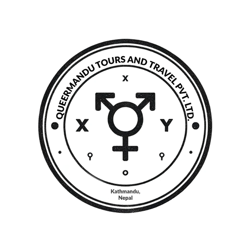
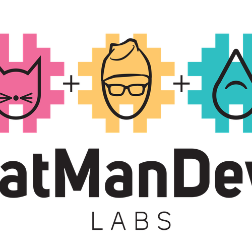
We did a stamp logo and here is a brief for that and we are also including a logo for a company called Catmandew Labs that we like.
At the heart of our stamp logo is a powerful emblem that merges the male, female, and transgender symbols, encapsulating our commitment to inclusivity and the celebration of gender and sexual diversity. This is a clear declaration of our company's welcoming embrace of the LGBTQ+ community. Encasing this symbol, two concentric circles unfold, which traditionally herald unity, community, and protection. This dual ring also subtly suggests the global reach of travel, an integral aspect of our identity as a travel company. Completing the motif, an array of crosses and dots dance around the circumference, evoking images of a world map sprinkled with countless destinations and experiences, alluding to the boundless travel opportunities we offer. These elements also hint at our ethos of 'diversity within unity', the core philosophy that guides our services and mission.
Please do not replicate the stamp logo. It's our stamp logo that is only used for legal purposes. We want something different.
Archivos finales del concurso
1 x Logotipo
Archivos finales
Si usa tipos de letra que requieren licencia, confirme que el cliente esté de acuerdo con su uso. Por motivos de licencias, es mejor proporcionarle a su cliente información sobre cómo adquirir el tipo de letra en lugar de proporcionarle los propios archivos.
El texto en logotipos debe convertirse a letras sin relleno.