Información necesaria
Nombre a incorporar en el logotipo
Fast Lane Soft
Eslogan a incorporar en el logotipo
Descripción de la organización y el público al que apunta
This is a logo for an outsourcing company in IT. The main business area is providing professional IT consultants to software company in order to consult them with their software projects.
The logo should look equally good in color and black&white. It should be applicable on both paper, and screen; also on white, black or transparent background. It should look great both in square and rectangular areas. Several versions of the logo are possible to achieve that.
Cold colors (blue/navy) are preferred but full freedom is given to the designers.
The main clients will be big software corporations, so it should look more serious, sophisticated and memorable. Also, it should look attractive to potential employees, giving feeling for reliable software company.
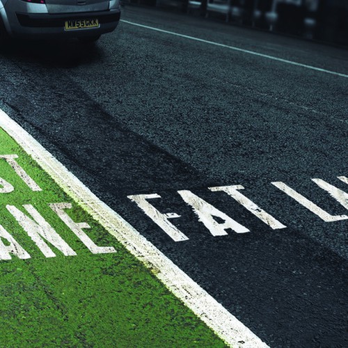
Fast Lane Soft logo should not make any associations with vehicles such as cars, planes or transportation. Using roads and lanes is okay if the main idea is preserved.
Good to have name incorporated in the logo - tip: 3 words, each has 4 letters.
FLS as abbreviation could also be distinct.
Keywords: IT, software, consulting, outsourcing, helpful, professional, knowledgeable, quick, progress, mature, competitive, premium, partnership, quality, flexible, result-oriented, innovative
Industria
Computación


Referencias


Otras notas
UPDATE:
Thanks everyone for your interest in the contest.
It may be a simple logo for you, but you are actually building the foundations of entire company.
After receiving the first designs, I have some better vision on the logo. I have just uploaded some assets to illustrate the idea. Here are the DOs and DONTs
DONTs:
Don't be boring. Sophisticated doesn't mean boring. You can put something "catchy"
Don't put frames and straight lines in the logo like most of the designs I have initially received. If there is a border, we should see a progress, and showing results beyond that border, also thinking out of the box... So don't put boxes.
Don't put many straight lines - little more curvy logo, showing arrows or lanes is what I am actually looking for.
Don't use serif fonts.
Don't separate "Fast" from "Lane", or focus differently. Consider it as one phrase - "Fast Lane" and do not emphasize on any of the words. "Soft" could be different.
DOs:
Do send me more and more designs. I'll try to provide timely feedback on each design you send me.
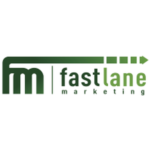
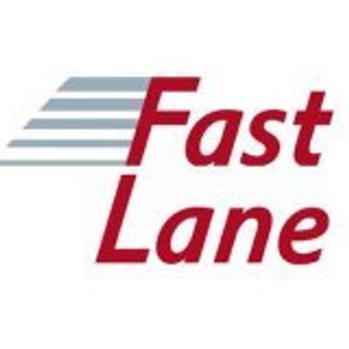
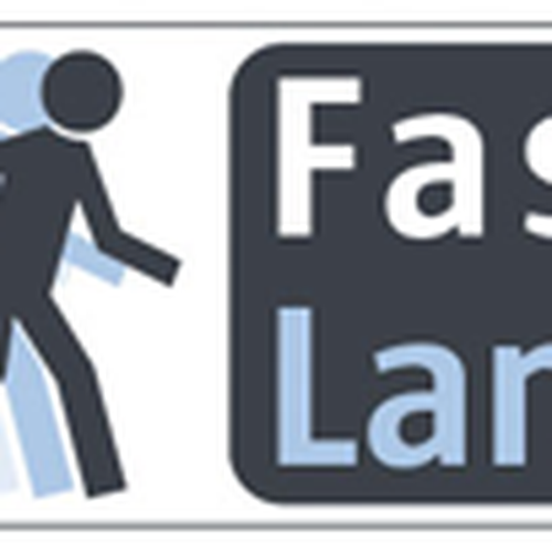
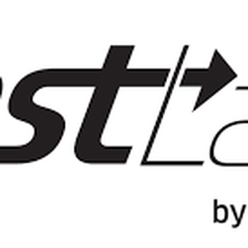
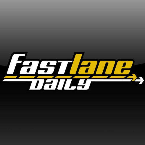
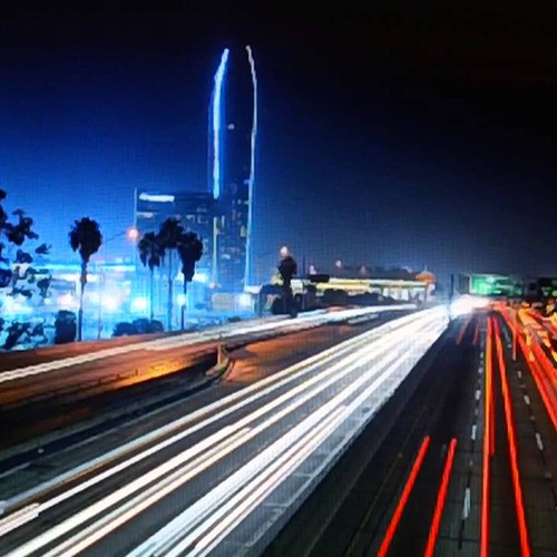
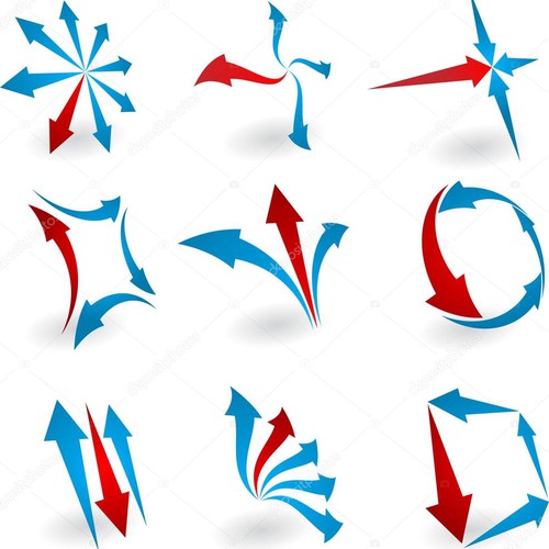
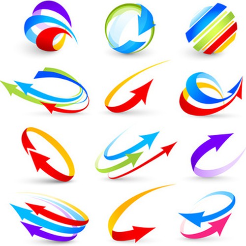
I want the logo to show speed. Look at the samples attached for some ideas.
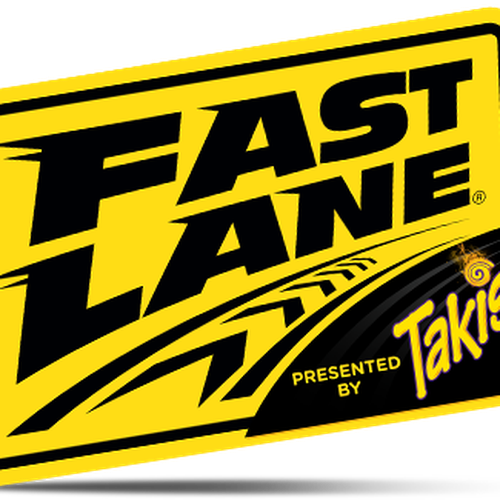
I want the logo to have arrows that symbolize lanes. The fast lane eventually in different color, longer, better, getting out of the bounds showing the best possible solution. Refer to the assets attached, again.
Symbols of road/path/way.
Sans Serif fonts. I like modern, contemporary look, bold font that is easy to read even when incorporated.
Consider "Fast Lane" (and even better - "Fast Lane Soft") as one single phrase.
Archivos finales del concurso
Logotipo
Archivos finales
Si usa tipos de letra que requieren licencia, confirme que el cliente esté de acuerdo con su uso. Por motivos de licencias, es mejor proporcionarle a su cliente información sobre cómo adquirir el tipo de letra en lugar de proporcionarle los propios archivos.
El texto en logotipos debe convertirse a letras sin relleno.
I like how part of the text is connected with the logo